
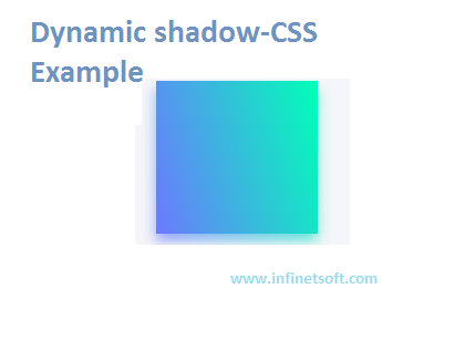
Create a shadow similar to the one box-shadow based on the color of the element itself.
HTML CODE:
<div class="dynamic-shadow-parent">
    <div class="dynamic-shadow"></div>
</div>
CSS CODE:
.dynamic-shadow-parent {
    position: relative;
    z-index: 1;
}
 .dynamic-shadow {
    position: relative;
    width: 10rem;
    height: 10rem;
    background: linear-gradient(75deg, #6d78ff, #00ffb8);
}
     .dynamic-shadow::after {
        content: '';
        width: 100%;
        height: 100%;
        position: absolute;
        background: inherit;
        top: 0.5rem;
        filter: blur(0.4rem);
        opacity: 0.7;
        z-index: -1;
    }
Description
Code snippets require some complicated situations to properly stack the context so that the pseudo-elements will be positioned below the element itself while still being visible.
- position: relative A Cartesian positioning context is established for the child elements on the parent element.
- z-index: 1 Create new stacked content.
- position: relative The positioning context of the pseudo-element is established on the child.
- ::after Define pseudo elements.
- position: absolute Takes a pseudo-element from the document stream and positions it relative to the parent element.
- width: 100% And height: 100% Resize the pseudo-element to fill the dimensions of its parent element to make them equal in size.
- background: inherit Causes a pseudo-element to inherit the linear gradient specified on the element.
- top: 0.5rem Pseudo-element is slightly offset from its parent element.
- filter: blur(0.4rem) Blur the pseudo-element to create the appearance of the shadow below.
- opacity: 0.7 Make the pseudo-element part transparent.
- z-index: -1 Position the pseudo-element behind the parent element.
Post your comments / questions
Recent Article
- How to create custom 404 error page in Django?
- Requested setting INSTALLED_APPS, but settings are not configured. You must either define..
- ValueError:All arrays must be of the same length - Python
- Check hostname requires server hostname - SOLVED
- How to restrict access to the page Access only for logged user in Django
- Migration admin.0001_initial is applied before its dependency admin.0001_initial on database default
- Add or change a related_name argument to the definition for 'auth.User.groups' or 'DriverUser.groups'. -Django ERROR
- Addition of two numbers in django python

Related Article