
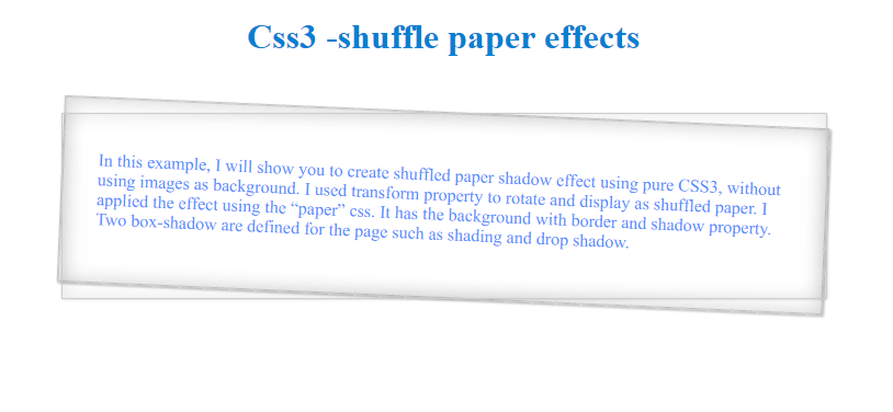
In this example, I will show you to create shuffled paper shadow effect using pure CSS3, without using images as background.
I used transform property to rotate and display as shuffled paper. I applied the effect using the “paper” css. It has the background with border and shadow property. Two box-shadow are defined for the page such as shading and drop shadow.
I applied the html shadow effect with different rotation angle using the pseudo elements and gets interesting effects.
HTML code:
<!DOCTYPE html>
<html xmlns="http://www.w3.org/1999/xhtml">
<head>
    <title></title>
    <style type="text/css">
        .papers, .papers:before, .papers:after {
            border: 1px solid #ccc;
            box-shadow: inset 0 0 30px rgba(0,0,0,0.1), 1px 1px 3px rgba(0,0,0,0.2);
        }

        .papers {
            position: relative;
            width: 50%;
            padding: 2em;
            margin: 50px auto;
            -webkit-transform: rotateZ(2.5deg);
            -o-transform: rotate(2.5deg);
            transform: rotateZ(2.5deg);
            z-index: -1;
            color: #4d90fe;
        }

            .papers:before, .papers:after {
                content: "";
                position: absolute;
                left: 0;
                top: 0;
                width: 100%;
                height: 100%;
            }

            .papers:after {
                -webkit-transform: rotateZ(-2.5deg);
                -o-transform: rotate(-2.5deg);
                transform: rotateZ(-2.5deg);
            }
    </style>
</head>
<body>
    <h1 style="color: #0480d1; text-align: center">Css3-shuffle paper effects</h1>
    <div class="papers">
        <p>
         In this example, I will show you tocreate shuffled paper shadow effect using pure CSS3, without using images as background.
 I used transform property to rotate anddisplay as shuffled paper. I applied the effect using the “paper” css. It hasthe background with border and shadow property. Two box-shadow are defined for the page such as shading and drop shadow.

        </p>
    </div>
</body>
</html>
Output:
Post your comments / questions
Recent Article
- How to create custom 404 error page in Django?
- Requested setting INSTALLED_APPS, but settings are not configured. You must either define..
- ValueError:All arrays must be of the same length - Python
- Check hostname requires server hostname - SOLVED
- How to restrict access to the page Access only for logged user in Django
- Migration admin.0001_initial is applied before its dependency admin.0001_initial on database default
- Add or change a related_name argument to the definition for 'auth.User.groups' or 'DriverUser.groups'. -Django ERROR
- Addition of two numbers in django python
Related Article